VisiTour

A voice assistant for low vision tourists


VisiTour is a voice assistant skill that helps users with low vision plan and go on solo holiday trips. VisiTour is a class project completed for my Designing Voice First Interfaces course at the University of Washington and is not affiliated with TripAdvisor.

Role

UX Designer

Duration

10 weeks

Skills

Voice interface design, persona generation, accessible design, usability testing

Brief

Design a voice system that can help a low vision tourist visit attractions on a solo trip.

Required deliverables: user flow, persona, usability test plan

Response

VisiTour is a voice first trip planning voice assistant skill for those who are still adapting to living with low vision.

VisiTour, a voice first trip planner for those who are still adapting to living with low vision.

VisiTour aims to reduce the stress of planning a trip by providing a voice interface to TripAdvisor's travel data, including curated lists, suggestions, and user reviews.

VisiTour also helps users get around and do activities on the day of their trip by referencing the planned list of locations to visit. If the user wants to get to their next destination, VisiTour can call an Uber on their behalf or show them the way to the nearest public transportation station.

But as we all know, most plans don't unfold as planned, so VisiTour is designed to accommodate changes like finding restaurants or restrooms when the need strikes. VisiTour is an Android voice assistant skill that helps users with low vision plan and take trips with just their voice.

Conduct research to plan your trip using just your voice

We wanted our user to focus on the trip and not have to spend too much time on their device. To do so, we implemented features such as quizzes to suggest pre-planned itineraries and integration with different apps to help them accomplish tasks quickly.

Be surprised by thoughtful suggestions

Using GPS, VisiTour can provide situationally relevant suggestions that low vision users may miss, such as when the user is near a popular selfie spot or a fun tourist activity.

Using location data to identify tourist hotspots

A pain point of voice is the amount of time it takes to listen and ask. To help prevent frustration, we designed VisiTour to reduce or increase behaviours according to the user's reactions. If the user rejects offers to take a selfie multiple times, then VisiTour will stop asking in the future.

Communicate DayTrip plans to other apps to ensure a smooth trip

VisiTour can act as a voice interface between the user and other apps like Google Maps and Uber, allowing them to leverage those services without needing to use the screen or exit VisiTour.

Research

What is "low vision"?

Low vision is a legal status that encompasses a spectrum of conditions, from partially blocked sight to full blindness. Age related vision loss, in particular, affects 4.2 million Americans aged 40 and above, causing them to lose confidence and independence.

Are people with low vision traveling alone? If so, what is their process?

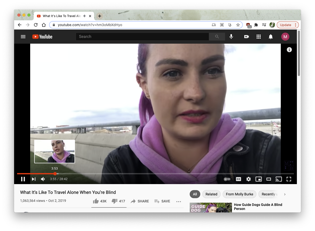
On top of confirming that people with low vision do travel alone, I also wanted to learn about their process. I found a wealth of videos and blog posts by people with low vision who wanted to share their experience and educate others.

Desk Research videos

What tools are they using and how are they using it?

Living with low vision and wanting independence is nothing new. Through our competitive research, we found many mobile tools that help low vision users navigate the world. Tools like Be My Eyes and Seeing AI help users "see" their surroundings and read texts to them.

However, these tools tend to be expensive because they require a human assistant on the other end to help them. These apps also require an internet connection and could be expensive because of their data consumption.

Persona

Meet Ben

He is a retired architect who is suffering from the onset of macular degeneration. His condition is untreatable by glasses and he is having a hard time adapting.

Ben's always dreamed of traveling solo when he retired, but he worries that his failing eyesight will prevent him from enjoying his trip (or even put him in harm's way).

He also finds it hard to read on his phone and computer, which prevents him from looking up the places he's interested in going to.

Synthesis

What is traveling like for Ben?

Ben's solo travel process

The start of a trip is not when you leave your door, but when you start planning it. As Ben's user journey map shows, the most "hands on" portion of his experience is also one of the most difficult. His vacation also has the highest potential for stress during times of unanticipated needs, such as needing to find a restroom.

However, there are still highlights during his trip such as the anticipation of the journey and having his travel plans unfold smoothly.

Finally, reflecting on his trip afterwards is also a critical positive portion of his experience, especially if his trip was a general success.

Design Values

Using our insights from our research, we generated the following values to help inform our design.

Treat the users like the adults they are.

Because of Ben's emphasis on independence, we decided to take a more hands off approach, especially during the trip taking phase. That also helps us treat his disability with respect.

But understand that they're still learning.

As Ben is still learning to live with low vision, it's up to us to provide him with the information that he doesn't know he needs to keep him informed.

So work with what they already know.

Our product is not about teaching Ben to use new technology, but augmenting his existing knowledge base with the benefits that voice interfaces afford.

Big design decisions

So how can voice interface technology help Ben?

I wanted to focus on improving Ben's travel experience, from start to finish. That means helping him research his destination, to getting around his destination, to reminiscing about his trip after its conclusion.

In order to do that, we decided to design a voice assistant skill for Google Assistants because it is a portable and customizable platform that Ben already owns.

Why TripAdvisor

Our team decided to design our product as an extension of TripAdvisor to leverage its database of travel information. TripAdvisor is also a well known and trusted brand, which helps build trust with Ben, who already feels vulnerable because of his low vision.

The Happy Path

Designing the experience

Research Phase

The most important part of the research phase was to reduce the time spent conducting research. I designed this portion of the experience to branch down from him selecting a city to asking about specific attractions.

I also added a quiz function that generates a list of attractions that fit Ben's interests and goals.

Trip Phase

The trip phase is fairly straightforward and is mainly focused on getting Ben from one location to another. VisiTour is designed to keep track of Ben's location and correlate that with the attractions he planned for. That way VisiTour can help Ben find transportation, a changing variable in this experience.

I decided to use this opportunity to provide additional services to Ben during his trip that is unique to VisiTour to him enjoy his trip.

AudioTours
When Ben arrives at an attraction, VisiTour can provide an audio tour that local guides have made. This gives him the option to hear from a local's perspective.

Photo Locations
When VisiTour detects that Ben is near a location that many TripAdvisor users have posted, it will alert him and ask if he wants to take a picture.

Finding Amenities
During Ben's trip, he can ask VisiTour to find amenities such as restrooms and restaurants nearby. VisiTour will guide him to the amenities and help him resume his trip afterwards.

Reflect Phase

During this phase, Ben is most likely is a safe location and might want to relive highlights form his trip. I decided to focus this phase on sharing his photos and experiences.

Using his voice, Ben can review his photos by the locations he visited and share them with his loved ones. He can also write reviews for the locations he visited on TripAdvisor and add the photos he took to the post.

Other Interaction Decisions

Because Ben is already familiar with using screen based technology, I decided to use the graphic interface as a secondary form of input. This would help Ben interact with VisiTour if he is not sure what voice command to use or just prefers pressing buttons.

To help visualize how recognizable the GUI may be, I used a low vision plugin in Figma to distort the screens to represent different vision conditions.

Visualizing what the screen looks like to low vision users

Validation

Usability testing our flow

Conversations are really difficult to design because you can't always anticipate the user's utterance. Although I constantly tested the design by talking it through with my teammates, I wanted to make sure the conversation flow made sense.

I also needed to assess how VisiTour impacts Ben's most trip, especially the research and freestyle phase.

We were unable to find any users who fits Ben's persona profile (newly living with low vision, has experience with technology) but believe that we could still get a lot of valuable feedback from testing with other audiences.

Usability Test Doc

We conducted our usability test with 3 members of my cohort WOZ style, but without the smoke and mirrors because the users were aware that I was roleplaying the voice assistant. I created a deck that helped us integrate some screens into the test as well and distracted the participants from the fact that they were speaking to me and not a voice assistant.

Usability Test Doc

This was a fun but challenging task for me because it was a last minute improvisation, as our test coincided with a VoiceFlow update that broke our prototype. Luckily, I was very familiar with the conversation flow (because I made it) and was able to use the flowchart as a script.

The hardest part was deciding when I should accept utterances/commands or throw errors, especially because I, a human being, was able to better understand their intention than a voice assistant could. It was very tempting to just give them an answer, but I stuck to the script as much as possible to gather accurate feedback.

Findings and Improvements

Acknowledging that the three doctors we tested with were not pediatricians, we were able to gain valuable feedback about our prototype to help us make the best use of our limited time with the MCPs during the design sessions. Here is what we found:

Finding

Thoughtful anticipation created delight

We found that our participants all enjoyed using the quiz to generate attraction recommendations. They thought it was a fun way to create a foundational Day Trip, versus having to pick every location one by one.

We also found that our participants were positively surprised when we provided information about a location's accessibility. As non-disabled people, our participants did not think to ask about how a bathroom may be handicap accessible. As we assumed Ben would not be used to thinking about his low vision as much, we believe that this would benefit Ben's experience positively.

Finding

Lack of clarity in language

Unsurprisingly, our participants were sometimes confused during several of our conversation points where the next action to take was not singular or immediately clear.

For example, our open ended tasks like "plan a trip to Seattle" scored less on the ease of use scale than tasks with clear end goals like "post a review on TripAdvisor". This was due to the broad language that could be applied to the planning task, versus the more limited vocabulary that could be applied to the review task.

Finding

Users were not clear about what VisiTour can do

Our feedback also indicated a lack of clarity about VisiTour's capabilities, such as the ability to locate bathrooms. According to a participant, "I wouldn't have known to ask it about bathrooms if you didn't ask me to do it". This could be a mismatch between a participant's understanding of travel apps and the requirements set forth by this assignment.

A potential solution to this issue is to design a better onboarding experience that clarifies VisiTour's level of involvement in the trip or VisiTour's features.

Full Flow (click to expand)

Conclusion

Next Steps

Design an onboarding system
Because our chosen user is still learning about their new condition, we also need to provide guidance about how to use VisiTour. Creating a clear and linear onboarding system that outlines VisiTour's capabilities would help the user get the most out of the app, even if they have to ask again later.

Bring the design into a standalone app
We chose to design our service as a voice assistant skill to help give us enough time to build the prototype deliverable for this project. However, after testing and revisiting our initial findings, I believe that VisiTour could deliver more value by being a standalone app that can control its display and save local data. This way, the user can download information about attractions before traveling to save mobile data.

Improve connection between visual and audio feedback through prompts
In order to provide better utility for the visual output, we need to have a smarter system that includes language that prompts the user about where to click on the screen. This would make it more clear to users who are not familiar with the screen's layout as well.

Integrate wearable tech for haptic feedback
To further our goal of reducing active screen time to help immerse the user in their trip, I'd also like to integrate wearables like smart watches into this ecosystem to provide helpful information when not being actively asked.

Reflection

As the primary focus of this class was to teach us about a new input method (voice), our team approached this project as more of an experimentation to learn the medium than a demonstration of our design expertise. Therefore we had a few stumbling blocks (aka learning experiences) along the way. Here are the main things that I've learned from this process:

Voice design should start from the highest possible level
Conversations live differently in writing than when spoken. As voice designers, we need to anticipate different ways a user might want to go about doing something and it helps to start designing from the intention level (high), rather than the specific written language level (low). This way, you can get the intended function down without getting stuck on the nitty gritty words.

When WOZing, leave your ego at the door
Our usability test was supposed to take place on Voiceflow, but because our project coincided with a major internal update, our prototype went completely kaput the night before our scheduled tests. So I quickly threw together a deck with screen mockups, put on my best Alexa voice, and became the prototype by reading from our flowchart. It was difficult to "throw errors" when I (a human being) understood their intention, but I stuck to the script and was able to identify several points of ambiguity in our design that needed fixing.

Voice systems should not be designed alone
Voice interfaces should be designed out loud. No matter how good I thought my inner conversation sounded, I always found errors when I spoke it out loud. While no voice system can account for every possible utterance, it's important to have multiple perspectives from the get go so that we can cover as much ground as possible when mapping out the conversations.